Children learn to read going letter-by-letter. To selecting typography for young target audience, the first important thing is the typeface has to be easy to read and set in the most readable way. Also, selecting the typeface that enchanting children to feel warm, friendly design, generous letter shapes and keep it simple.
Sans serif typefaces could be right for children because these typeface contain the simplest letterforms. “Sans serif is better for children learning to read”
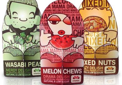 |
VitaMeal food products
|

 |
Natural history museum sandwich
|
Title type gives an opportunity to be more playful and decorated typestyles, lots of coluor, and curved and jumping baselines can all be used to attract and entertain the young audience.

 |
Cheesesrings Spaghetti package
|
No comments:
Post a Comment