Monday 7 May 2012

How to design package for children? : Milk project


Objective:
To design the milk package for children to consider how an everyday commodity like ‘Milk’ could be packaged in a more effective way to the children. Also, make fresh milk easier to
drink on the move. 

Tone of voice:
Friendly and Fresh

Target audience:
Young audience ages between 7-10

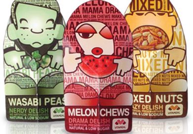
Surface of package design for children
Graphic: The collective balance between composition of visual elements and messaging. Also, keep it simple and easy to understand.

Colour: Used colours on the assumption of bright colours.

Typography: Style and character via letterforms has an impact far deeper than the literal meaning of the words they form. The typeface has to be easy to read and set in the most readable way.


Flavoured milks are identify by using recognizable colours. For example: Brown for chocolate.


Contain secondary feature panels such as quiz which can help enhance general children’s knowledge.


Saturday 5 May 2012

Typography for children's package.


Children learn to read going letter-by-letter. To selecting typography for young target audience, the first important thing is the typeface has to be easy to read and set in the most readable way. Also, selecting the typeface that enchanting children to feel warm, friendly design, generous letter shapes and keep it simple.


Sans serif typefaces could be right for children because these typeface contain the simplest letterforms. “Sans serif is better for children learning to read”

VitaMeal food products
Natural history museum sandwich
Title type gives an opportunity to be more playful and decorated typestyles, lots of coluor, and curved and jumping baselines can all be used to attract and entertain the young audience.

Cheesesrings Spaghetti package


Friday 4 May 2012

How graphics uses to influence the children's market?


   This post base on my research, collecting information from various secondary resources, including textbook, companies’ data, and online articles. I hope it may useful for those who interesting in package design area.

   Children feel about the package is often transferred to how they feel about the product itself in term of ‘sensation transference’. So, if the designer creates a package that can likely influence the positive feelings of children, the children’s preference of that certain product is likely enhanced also.

The best way uses graphic to design a package for maximum children appeal as following:

   - Creating the personalities’ actions through colourful illustrations that expand their activities the package will create ‘want to have it’ selling atmosphere to attract children.

    - Creates a link between a child’s imagination and how successfully it can accommodate the children’s natural play instinct.
Contain secondary feature panels such as stories, games or collectable items
Some products, the ability to see and touch the actual product is more important


Children’s products packaging needs to include as much information as possible in a language understandable to children of the age level to which the product applies.
  

Wednesday 2 May 2012

Understand more about how package design work.

Check the links below: 


To know about packaging's role, graphics on packaging, shape and materials used.
The power of packaging design


To know how to create product packaging that sells.
Package design tutorial

Design base on low cost material

How to know the materials and cost? I have provided some of the retail websites. 
check the links below:


Ukpackaging


Macfarlane package


Kitepackaging


Case study: Sunglasses box project
Objective: Design an economic sunglasses box that uses low cost materials which


compliments the price of the product.

Tone of voice:  Fun and Creative

Material: Cardboard


   This sun glasses box is specially designed for muti-purpose usage. Fundamentally, it serves the main objective of a sunglasses holder which is to protect the lens. In addition, the package can be used as a product stand or hanger to display the item at point of purchase.


Tuesday 1 May 2012

Environmentally friendly package: Green Package


PET Plastic used in wine packaging


Objective
         Designing a plastic vessel of wine that will reflect the value of the product which breaks the stereotype that consumers may hold with this type of package. Designing the package to reflect the quality of the product by creating a bespoke design which reflects a premium product. 

Overview

- Can influence purchase
- Recyclable
- Out-standing at the point of purchase 


Function: The lid is changeable and the bottle can be  reused as a watering bottle for domestic plants. This makes it a recyclable and environmentally sustainable product.